
The Sietch blog publishes an interesting map of the world where country sizes are proportional to the size of their underground oil reserves.
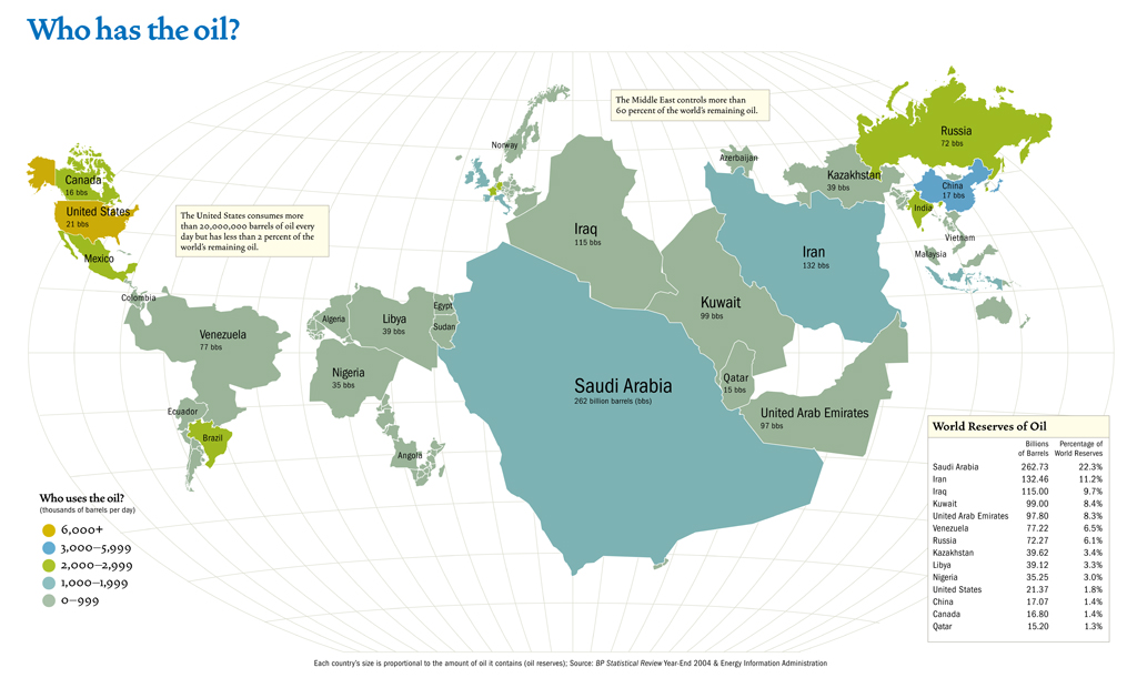
Colors can also point to the big users of oil (headed by the United States of America) which are also the big CO2 producers.
Why do you believe that every country in the world is looking at Saudi Arabia as if it was the princess of the Arabian Nights? You can also forecast that our gouvernments will be forced to speak politely to a number of countries they ignored up to now: Libya, Kazahkstan or even Sudan and Angola.
Leave a Reply